
WPF 基础到企业应用系列6——布局全接触
Border 是一个装饰的控件,此控件绘制边框及背景,在 Border 中只能有一个子控件(这个子控件又可以包含多个子控件)。Border 的几个重要属性:Background:用用一个 Brush 对象来绘制背景;BorderBrush:用一个Brush 对象来绘制边框;BorderThickness:此属性设置 Border 边框的大小;CornerRadius:此属性设置 Border 的每一个角圆的半径;Padding:此r属性设置 Border 里的内容与边框的之间的间隔。
要实现的效果如下图(用XAML和C#实现同一效果): 
XAML代码实现:
<Window x:Class="WPFLayoutDemo.BorderDEMO"
   xmlns="http://schemas.microsoft.com/winfx/2006/xaml/presentation"
   xmlns:x="http://schemas.microsoft.com/winfx/2006/xaml"
   Title="BorderDEMO" Height="300" Width="300">
  <Border
   BorderThickness="5"
   BorderBrush="Green"
   CornerRadius="10"
   Background="LightGray"
   HorizontalAlignment="Left"
   VerticalAlignment="Top"
   Width="270"
   Height="250">
    <Canvas Background="LightCyan">
      <Rectangle
       Canvas.Left="30" Canvas.Top="20"
       Height="200" Width="200"
       Stroke="Black" StrokeThickness="10" Fill="Red"/>
    </Canvas>
  </Border>
</Window>
C#代码实现:
namespace WPFLayoutDemo
{
public partial class BorderDEMOCodeBehind : Window
{
public BorderDEMOCodeBehind()
{
InitializeComponent();Border border = new Border();
border.Background = new SolidColorBrush(Colors.LightGray);
border.BorderThickness = new Thickness(5);
border.BorderBrush = new SolidColorBrush(Colors.Green);
border.CornerRadius = new CornerRadius(15);
border.Width = 270;
border.Height = 250;
Canvas cnvas = new Canvas();
Rectangle rect = new Rectangle();
rect.Width = 200;
rect.Height = 200;
rect.Fill = new SolidColorBrush(Colors.Black);
rect.StrokeThickness = 10d;
cnvas.Children.Add(rect);
border.Child = cnvas;
this.Content = border;
}
}
}
十二. ScrollViewer
通常用户界面中的内容比计算机屏幕的显示区域大,大出的部分就会破坏原有的布局。利用 ScrollViewer 控件可以方便地使应用程序中的内容具备滚动功能。这样大出的部分就可以正常显示出来了。常用属性、事件和继承关系见下面类图:

要实现的效果如下图(用XAML和C#实现同一效果): 
XAML代码实现:
<Window x:Class="WPFLayoutDemo.ScrollViewerDEMO"
   xmlns="http://schemas.microsoft.com/winfx/2006/xaml/presentation"
   xmlns:x="http://schemas.microsoft.com/winfx/2006/xaml"
   Title="ScrollViewerDEMO" Height="300" Width="300">
  <Grid>
    <ScrollViewer>
      <Rectangle Width="500" Height="500" Fill="Gray"></Rectangle>
    </ScrollViewer>
  </Grid>
</Window>
C#代码实现:
namespace WPFLayoutDemo
{
public partial class ScrollViewerDEMOCodeBehind : Window
{
public ScrollViewerDEMOCodeBehind()
{
InitializeComponent();ScrollViewer myScrollViewer = new ScrollViewer();
myScrollViewer.HorizontalScrollBarVisibility = ScrollBarVisibility.Auto;Rectangle myRectangle = new Rectangle();
myRectangle.Fill = Brushes.Gray;
myRectangle.Width = 500;
myRectangle.Height = 500;myScrollViewer.Content = myRectangle;
this.Content = myScrollViewer;
}
}
}
十三.布局综合应用
前面通过十多个小节讲了一些常用Panel的基本用法,那我们这里就简单做一个综合的小例子,通过这个例子,旨在巩固前面的内容,也可以当做一个举一反三的过程。要实现的效果如下图: 
XAML代码实现:
<Window x:Class="WPFLayoutDemo.PuttingItAllTogether"
xmlns="http://schemas.microsoft.com/winfx/2006/xaml/presentation"
xmlns:x="http://schemas.microsoft.com/winfx/2006/xaml"
WindowStartupLocation="CenterScreen"
Title="布局综合运用" Width="640" Height="480"><
DockPanel Width="Auto" Height="Auto" LastChildFill="True">
<!--Top Menu Area-->
<Menu Width="Auto" Height="20" Background="LightGray" DockPanel.Dock="Top">
<!-- File Menu -->
<MenuItem Header="文件">
<MenuItem Header="保存"/>
<Separator/>
<MenuItem Header="退出"/>
</MenuItem>
<!-- About Menu -->
<MenuItem Header="帮助">
<MenuItem Header="关于本产品"/>
</MenuItem>
</Menu><!--State -->
<StackPanel Width="Auto" Height="31" Background="LightGray" Orientation="Horizontal" DockPanel.Dock="Bottom">
<Label Width="155" Height="23" Content="状态栏" FontFamily="Arial" FontSize="10"/>
</StackPanel><!--Left-->
<StackPanel Width="136" Height="Auto" Background="Gray">
<Button Margin="5,5,5,5" Width="Auto" Height="26" Content="导航栏"/>
<Button Width="126" Height="26" Content="导航栏" Margin="5,5,5,5"/>
<Button Width="126" Height="26" Content="导航栏" Margin="5,5,5,5"/>
</StackPanel><!--Right-->
<Grid Width="Auto" Height="Auto" Background="White"><
Grid.ColumnDefinitions>
<ColumnDefinition Width="*"/>
<ColumnDefinition Width="*"/>
</Grid.ColumnDefinitions><
Grid.RowDefinitions>
<RowDefinition Height="*"/>
<RowDefinition Height="*"/>
</Grid.RowDefinitions>
<Rectangle Fill="Gray" Margin="10,10,10,10" Grid.Row="0" Grid.Column="0"/>
<Rectangle Fill="Gray" Margin="10,10,10,10" Grid.Row="0" Grid.Column="1"/>
<Rectangle Fill="Gray" Margin="10,10,10,10" Grid.Row="1" Grid.Column="0"/>
<Rectangle Fill="Gray" Margin="10,10,10,10" Grid.Row="1" Grid.Column="1"/>
</Grid></
DockPanel>
</Window>
其实用熟练上面的各个布局控件以后,你会发现布局UI是一件非常容易的事,遇到一个新的UI,你会发现任意一个Panel都可以实现你的需求。当然对于较复杂且对要求很高的UI,我们也会自定义一些Panel,在下面我们就简单介绍一下自定义布局控件。
十四.自定义布局控件
讲到自定义布局控件,我们必须得先谈一下在WPF中自定义控件,在WPF自定义控件你可以选择下图的一些基类作为继承对象,你也可以继承自已有的一些控件,这个就看你的需要了。其实开发WPF自定义控件和开发WinForm、ASP.NET自定义控件基本类似,只是要注意一些特别的地方,比如依赖属性的处理、路由事件、视觉树和逻辑树等等。

由于今天只是讲如何开发一个自定义的Panel,所以在清楚了基类的前提下,首先得了解它有哪些属性和事件,这样就可以确定哪些是不需要单独写、哪些是需要override。下图就是Panel和基类FrameworkElement 的类图:

在清楚了上面这张图以后,我们就可以着手开始写了,我们知道布局系统的工作原理是先测量后排列,测量就是确定面板需要多大空间,排列则是定义其面板内子元素的排列规则。自定义面板要继承自Panel类并重写MeasureOverride和rrangeOverride方法即可,如下便是一个简单的自定义Panel:
namespace WPFLayoutDemo
{
public class PlotPanel : Panel
{
public PlotPanel()
: base()
{
}//重写默认的Measure方法
protected override Size MeasureOverride(Size availableSize)
{
Size panelDesiredSize = new Size();
foreach (UIElement child in InternalChildren)
{
child.Measure(availableSize);
panelDesiredSize = child.DesiredSize;
}return panelDesiredSize;
}//重写默认的Arrange方法
protected override Size ArrangeOverride(Size finalSize)
{
foreach (UIElement child in InternalChildren)
{
double x = 50;
double y = 50;child.Arrange(new Rect(new Point(x,y), child.DesiredSize));
}
return finalSize;
}
}
}
控件的最终大小和位置是由该控件和父控件共同完成的,父控件会先给子控件提供可用空间(availableSize),子控件再反馈给父控件一个自己的期望值(DesiredSize),父控件最后根据自己所拥有的空间大小与子控件的期望值分配一定的空间给子控件并返回自己的大小.那么这个过程就是通过MeasureOverride 和ArrangeOverride这两个方法来完成(注意父控件的availableSize是减去Margin、padding等的值)。
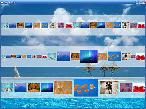
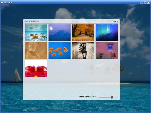
本来想自己开发一个较复杂的Panel控件放上来,但一搜网络,发现已经有很多很好的Panel控件,所以在这里我也不写那么多了,大家可以研究一下这些控件,我也研究了几个,觉得最好理解且最美观的当属“FishEyePanel & FanPanel, Paul Tallett, codeproject ”,大家可以根据链接过去看一下,Paul Tallett讲解得非常的细致。
- TreeMapPanel, Kevin Moore (see bag-o-tricks for code)
- AnimatingTilePanel, Kevin Moore (see bag-o-tricks for code)
- Disposing Virtualizing Stack Panel, Aaron, WiredPrairie.us
- TimeLinePanel, Rob Zelt, robzelt.com (with credit to Robert Ingebretsen and Lauren Lavoie)
- Chart and Lens Panel by John Stewien (code available?)
- DiagonalPanel
- FishEyePanel & FanPanel, Paul Tallett, codeproject
- RadiaPanel & ItemsRadialPanel, Rhett log (Henry Hahn posted a Radial panel in 2005, but I'm not sure if it runs or not?)
- DisclaimerPanel, Chaz
- SpanningStackPanel, Nick Theusen
- PlotPanel, Windows SDK Sample
- CollapsiblePanel, Thomas Lebrun
- CornerStacker, Nick Thuesen
- StickyPanel, Unni, Blend PM
- ItemSkimmingPanel, Pavan Podila
顺便也链接两幅图:
讲到这里,我们也顺便提一下写WPF自定义控件的几个步骤,以后在讲到这一节的时候会详细讲解:
- 首先你得清楚你的自定义控件是干什么用的(能解决什么问题)?公用到什么程度(其他项目也可以用、本项目用、项目当中一个模块用、只有一个地方用)?是继承已有的控件还是从头写?对设计时是否支持?样式和模板的定义等。
- 确定好了上面的步骤后,我们就可以建立项目的结构,类和资源文件等该放在什么位置也就在这一步确定。
- 选择要继承的基类(UIElement、FrameworkElement 、Control 、ContentControl 、HeaderedContentControl 、ItemsControl 、Selector 、RangeBase还是已有的一些控件)。
- 重写默认的样式和新建一些样式并附默认值。
- 由于WPF的属性基本都是依赖属性,所以我们也要新建一些依赖属性。
- 逻辑树和视觉树的一些处理以及事件等。
十五.本文总结
今天我们主要讲了WPF布局系统,对整个布局系统的原理、各个Panel的基本用法以及自定义布局控件做了一些介绍,由于本文不是专门进行这方面的研究,所以只能给大家提供一个参考,如果大家想了解更多,还需要去看专门的教材,同时有些知识也只是个人的一些见解,所以大家只能将就着看了。写篇文章也是怀着技术交流的心态发布出来,由于是自己对这些技术的使用总结和心得体会,错误之处在所难免,所以希望大家能够多多指点,这样也能纠正我的错误观点,以便和各位共同提高!
最后如果大家感兴趣,可以关注WPF 基础到企业应用系列索引这个系列文章,我也会不定期的逐渐更新,谢谢各位的关注,也欢迎和各位交流讨论。
最后也附上代码结构图和代码下载:

下载链接:WPFLayoutDemo.zip
